 Back to main page
Thinking in systems.
Not by each frame.
Overview
Product workflows has hugely shifted from low-fi → high-fi → design system to now almost being entirely reverse where high-fi and design systems are beginning to blend.
As a result, I decided to create a design system myself for my own personal portfolio to adapt to the growing agent based design workflows where I feed my agents with my own personal branding and design system to make developing new screens and iterations so much faster.

The stack
How it’s built.
- How is it designed?
- Hand designed manually directly inside of Figma in terms of page layouts, components, and using various colors.
- How is it developed?
- Using Figma MCPs and Claude Code to develop the full website into something fully functional fully published on Vercel.
The system
How it comes together.
- How is it used?
- This design system allows me to use components easily to create new designs efficiently.
- What about agents?
- Keeping agents in mind, I developed this design system to ensure any coding tool can read through the design system documentation with ease to easily replicate designs in my own style.
Foundations
Foundations don’t just establish the details of your brand. It also establishes the tone and feel of what you’re building.

Jason Jeong
Mood & Tone
This design system embodies a “playful minimalism” style where there is minimal content throughout with slick designs but still maintains a level of playfulness through vibrant colors that are speckled in throughout.
Elements of minimalism come into play through the usage of black and white as primary colors throughout the website and the font “Satoshi” for body texts where information needs to be easily consumed by users.
Elements of playfulness seep through the website in each project page where small specks or components are filled with each respective vibrant color. The usage of the font Bricolage Grotesque allows for more fun experimentation through a fun typography that is more dynamic than a traditional flat sans-serif or mono font.
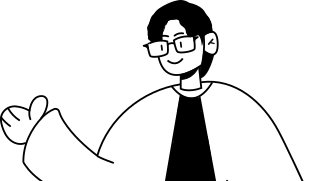
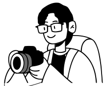
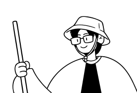
The primary character design of myself also adds to the playful minimalism by incorporating a vector design of a character that has both a minimal and slick look to it but also adding a lot of fun throughout the website as well.


Color palette
This design system contains a simple palette consisting of various shades of grays as the primary color palette alongside a few vibrant colors that represent each project. There are a total of 6 different project colors.
Typography
This design system composes of two primary typefaces: Bricolage Grotesque and Satoshi.
Bricolage Grotesque creates a more playful and fun feel towards the website really allowing me to showcase my playfulness when I design. It also just compliments to character designs.
Satoshi provides a more minimal and simple experience to the user as they are reading the contents of my website. It’s slick and clean look makes text easier to read and digest because of its sans-serif nature.
Bricolage Grotesque
Playfulness

Satoshi
Minimalism
Spacing
Everything sits on a 4-point grid. Every margin, padding and gap is a multiple of 4, so layouts line up on their own and spacing decisions stay quick.
These are the steps the system actually uses. The only things off the grid are 1px hairlines and the line heights that come with each type style.
- 4Eyebrow → heading, between tabs1
- 8Icon → label, Sub-title → body, chip gaps2
- 12Card grid gap, control padding (x)3
- 16Gutter on mobile, bubble padding4
- 20Neutral swatch rows5
- 24Between paragraphs, stacked groups6 · --space-paragraph
- 40Section intro → its content10 · --space-intro
- 48Swatch columns, card padding (lg)12
- 72Column gaps, page top padding18
- 136Between sections (96 tablet, 72 mobile)34 · --space-section
Motion
Motion is where the playfulness comes through, so it stays quick and quiet in the UI and slow, like breathing, in the character. Distances follow the same 4-point grid.
Hover a card to play its curve.
ease-out-soft
cubic-bezier(0.22, 1, 0.36, 1)
Default for UI: hovers, entrances, fades
ease-spring
cubic-bezier(0.34, 1.56, 0.64, 1)
Playful overshoot: chip lift, menus, bubbles
ease-sway
cubic-bezier(0.37, 0, 0.63, 1)
Looping back-and-forth: the head bob
ease-lid
cubic-bezier(0.45, 0, 0.9, 0.55)
Closing fast and snapping shut: eyelids
ease-rebound
cubic-bezier(0, 0.55, 0.45, 1)
The release after a squash: eyes opening
- FeedbackHover, press, color changes150–200ms
- OverlayMenus and speech bubbles, with ease-spring250ms
- Page exit / enterRoute changes: fade, drift and blur220ms / 520ms
- Entranceanimate-rise, staggered 80ms700ms
- Accentanimate-blink / animate-blink-twice180ms / 450ms
- Idle loopanimate-bob, infinite3.2s
Assets
The marks, characters and icons that carry the brand. Every asset is a vector exported straight from Figma and lives in /public/brand.
Logo mark
Characters
Icons
UI icons come from Lucide at 20px with a black stroke.

